


Brand Guide 2025
This guide defines the visual language, design style, and principles that shape a clear and consistent brand experience, no matter the team or area of expertise.
Brand Strategy
Personality
Tone & Voice
Keywords
Emotional Drivers
Seven Seconds
Campaign Slogans
Story
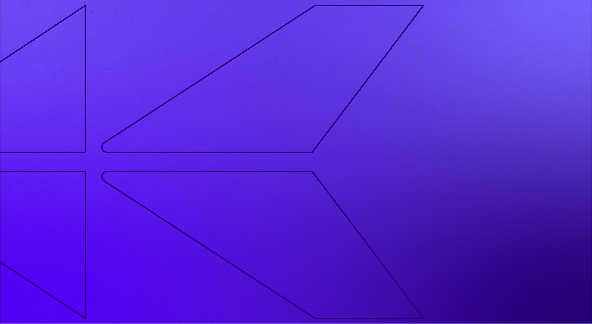
Logo
Primary Lockup


Secondary Lockup

tertiary Lockup


Do not outline the mark


Do not use a gradient on the mark


Do not use a drop shadow on the mark


Do not reverse or flip the mark


Do not stretch or squash the mark

Color
Color Palette


ADA Compliance
Gradients
Typography
Headings & paragraphs
Inter Bold 85px
Heading 1
Inter Regular 52px
Heading 2
Inter Regular 32px
Heading 3
Lora Regular 20px
Paragraph
Lora Bold 20px
Paragraph Bold
01
02
03
04
05
06
07

08
ad1

ad2

ad3
ad4
Brand in Use
The following mockups are to give an idea of the tone of the brand in action. Strong, courageous, simple, but sophisticated.
Let the Crown Current color do some heavy lifting, by infusing a feeling of royalty and energy to the products.
But never forget that more often than not, your clients are in the hardest time of their lives, and it’s your job to protect them, to make them feel safe, fought for.
b1
b2
b3
b4
m1
m2
contact the king
All Rights Reserved
Brand Guide 2025
This guide defines the visual language, design style, and principles that shape a clear and consistent brand experience, no matter the team or area of expertise.
01
Brand Strategy
02
Personality
02a
Tone & Voice
02b
Keywords
02c
Emotional Drivers
02d
Seven Seconds
02e
Campaign Slogans
02f
Story
03
Logo
03a
Primary Lockup


03b
Secondary Lockup

03c
tertiary Lockup
03d
incorrect usage
We love our logo and love your creativity, but sometimes creativity can push the bounds to places that we don’t really want to go. Here are a few more common mistakes that—if made—are going to give off the wrong impression with our logo, so let’s try to avoid these.
*There is a purple gradient below that you are allowed to use but only on the K icon itself, steer clear from using that gradient on the words.

Do not outline the mark
01


Do not use a gradient on the mark
02


Do not use a drop shadow on the mark
03


Do not reverse or flip the mark
04


Do not stretch or squash the mark
05
04
Iconography
The King Firm “K” is almost a square, meaning it fits well within 1x1 ratios, making it a strong and versatile icon to use in a variety of different situations; from merchandise to profile photos, this icon is sufficient.

05
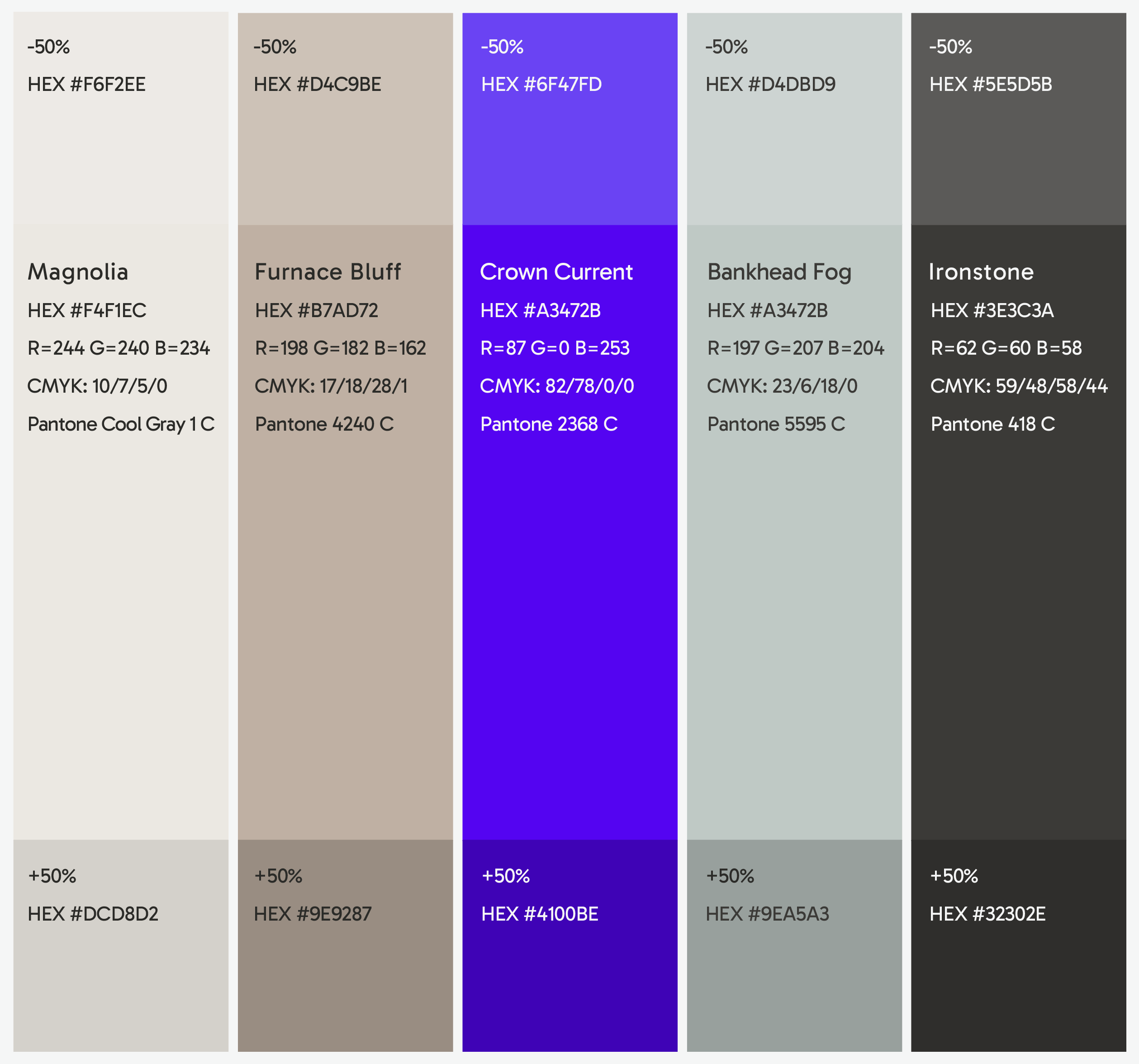
Color
05e
Color Palette
05c
Color Ratios
By using these colors, we can easily and naturally draw the users’ eyes to the calls to action or important text by limiting certain colors to specific moments.
In this instance, the palette should be majority Magnolia, Ironstone, and Banhead Fog as your backgrounds—in that order. This allows us to use Furnace Bluff and Crown Current as deliberate pops that highlight key pieces of information or calls to action.
05c
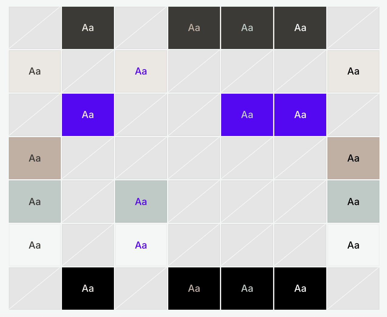
ADA Compliance
05d
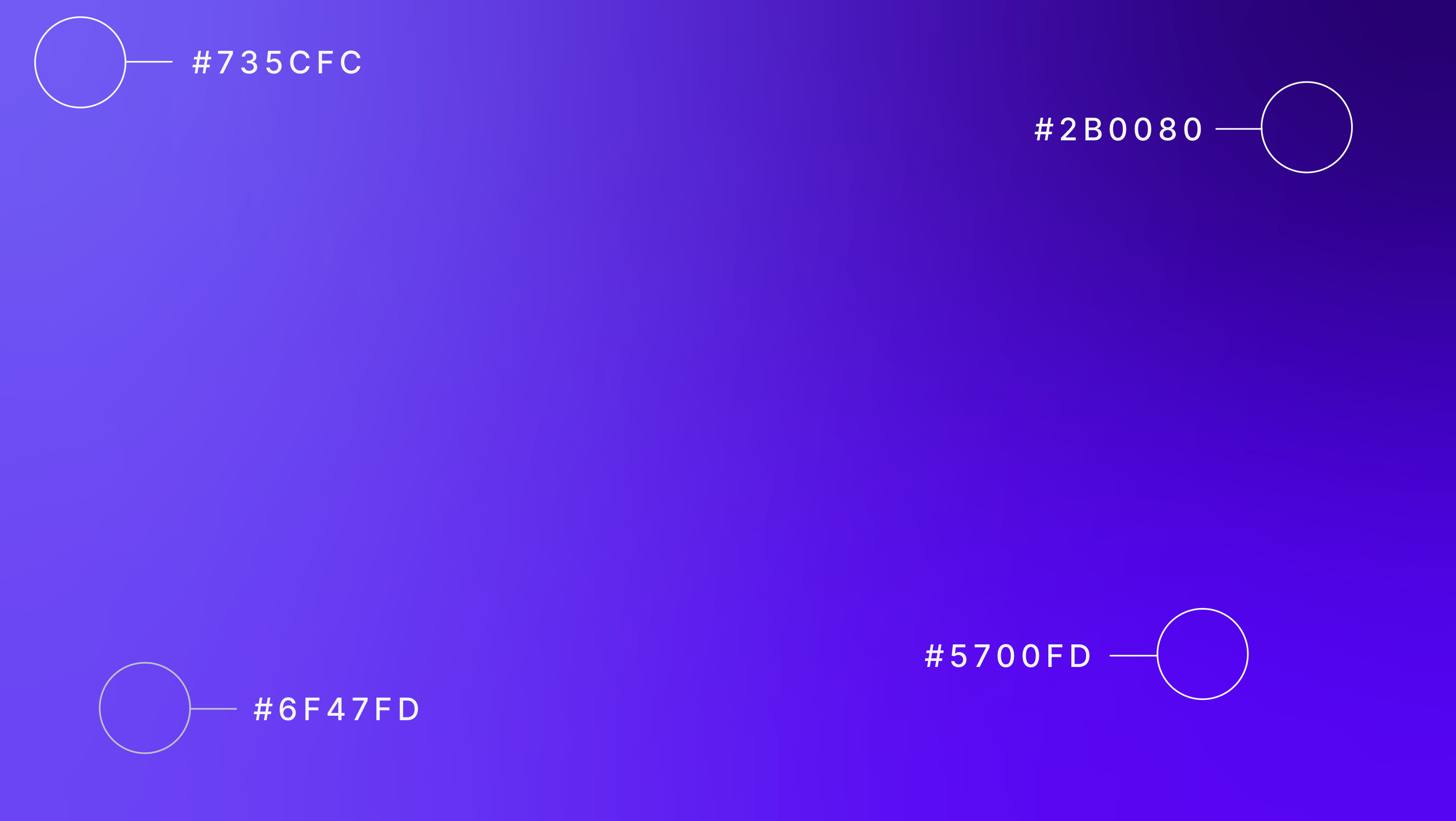
Gradients
06
Typography
06a
Headings & paragraphs
Inter Bold 85px
Heading 1
Inter Regular 52px
Heading 2
Inter Regular 32px
Heading 3
Lora Regular 20px
Paragraph
Lora Bold 20px
Paragraph Bold
07
Patterns
01
02
03
04
05
06
07
08
08
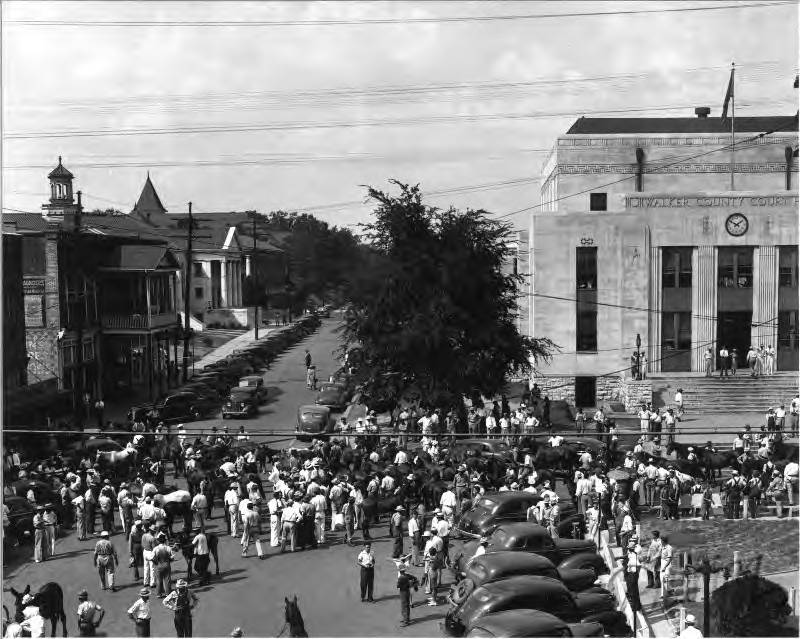
Art Direction
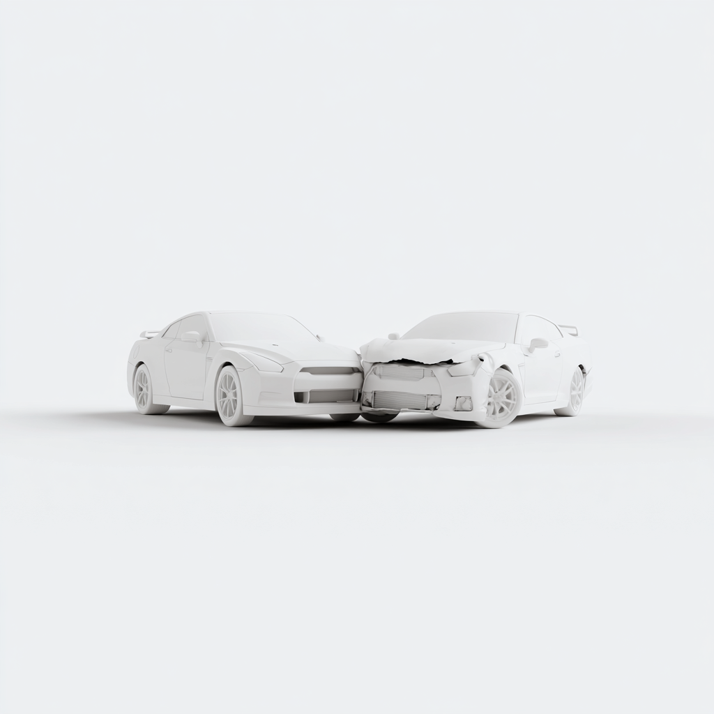
As you can imagine, the imagery that is used within the law space tends to be saturated with obvious stock solutions that leave each law firm feeling void of personality.
We hope to turn that around. When it comes to calling out the kinds of services or areas of law you cover, use Ai to do the heavy lifting. Using prompts like “two 3Dimensional model cars made out of porcelain, in a collision, tones of white, minimalism, simple, clay render. White background.”
This allows the tone of the imagery to stay sophisticated and not as jarring or aggressive, while still communicating the tragedy.
Alternatively, you can try hand-drawn cartoon illustrations, again, generated with Ai using a prompt like “A simple flat cartoon vector illustration of a worried truck driver, standing next to a toppled over 18 wheeler, bright color palette, white background, minimalist”.
Generations like these allow for the heavy topic of injury or accident to feel less daunting and in the loving, caring hands of a good firm.
Lastly, we hope to elevate the client by using authentic and professional photography. Specifically, capturing them on the job, using the contrast of the quality of the photograph and the potentially harsh environments they work in to play together in a positive way.
ad1
ad2
ad3
ad4
09
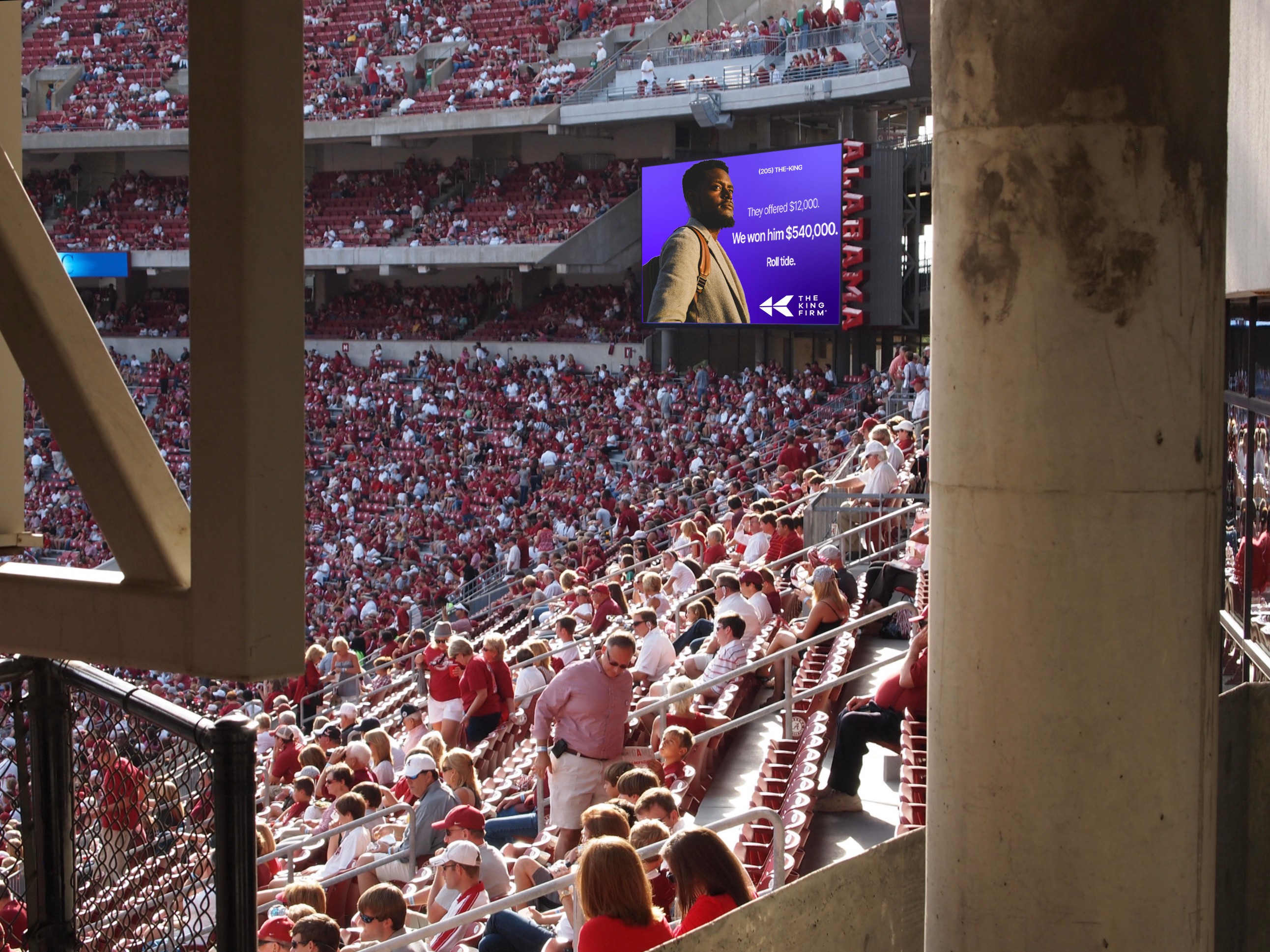
Brand in Use
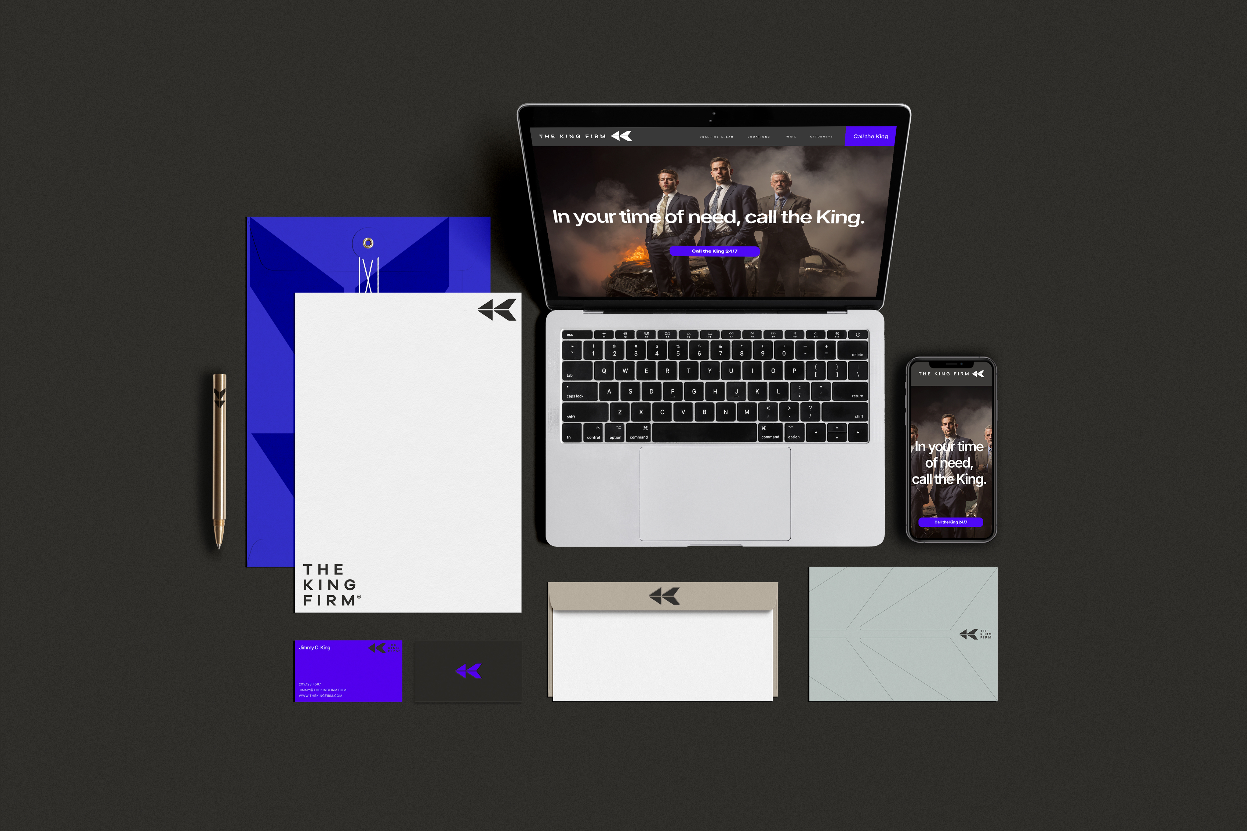
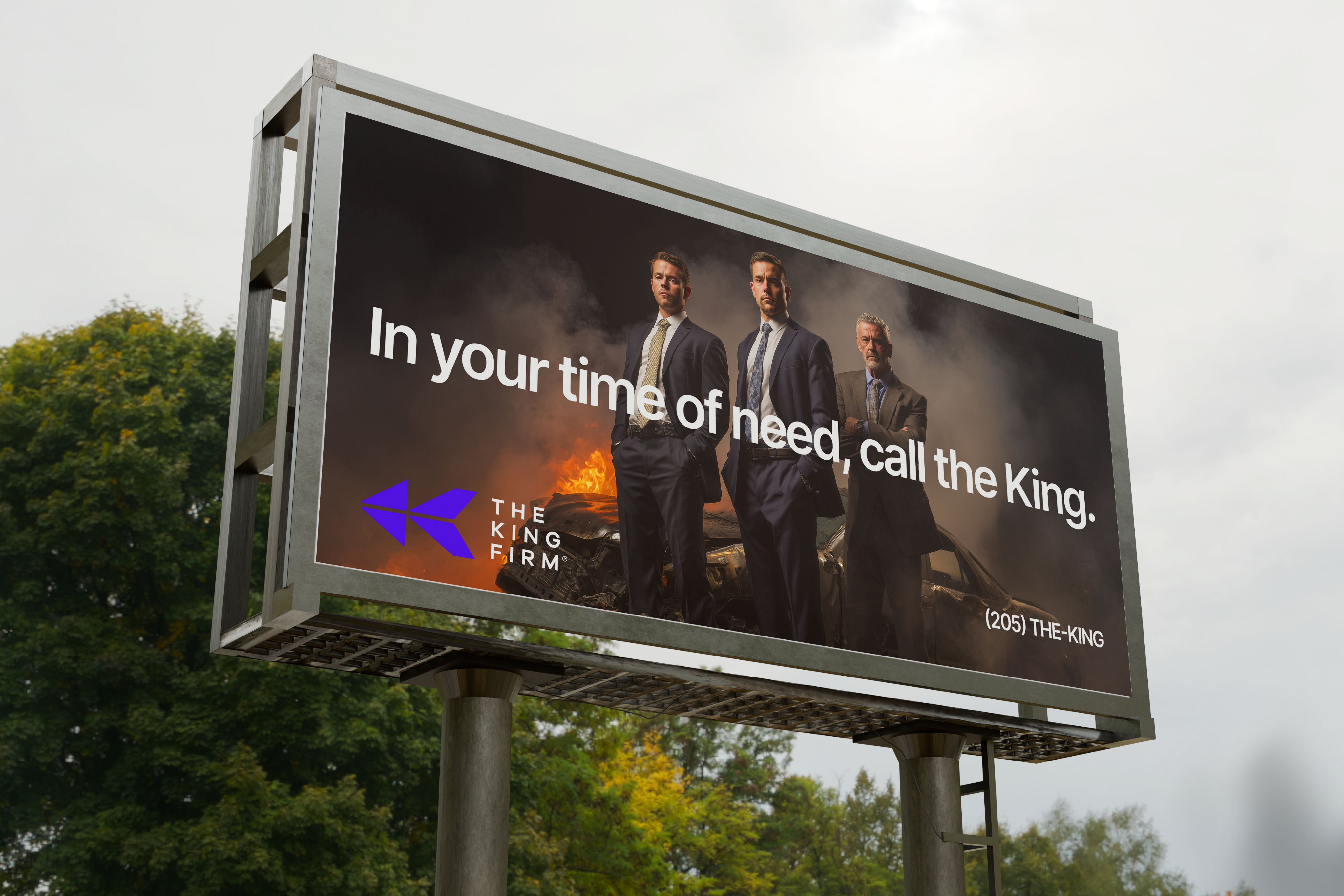
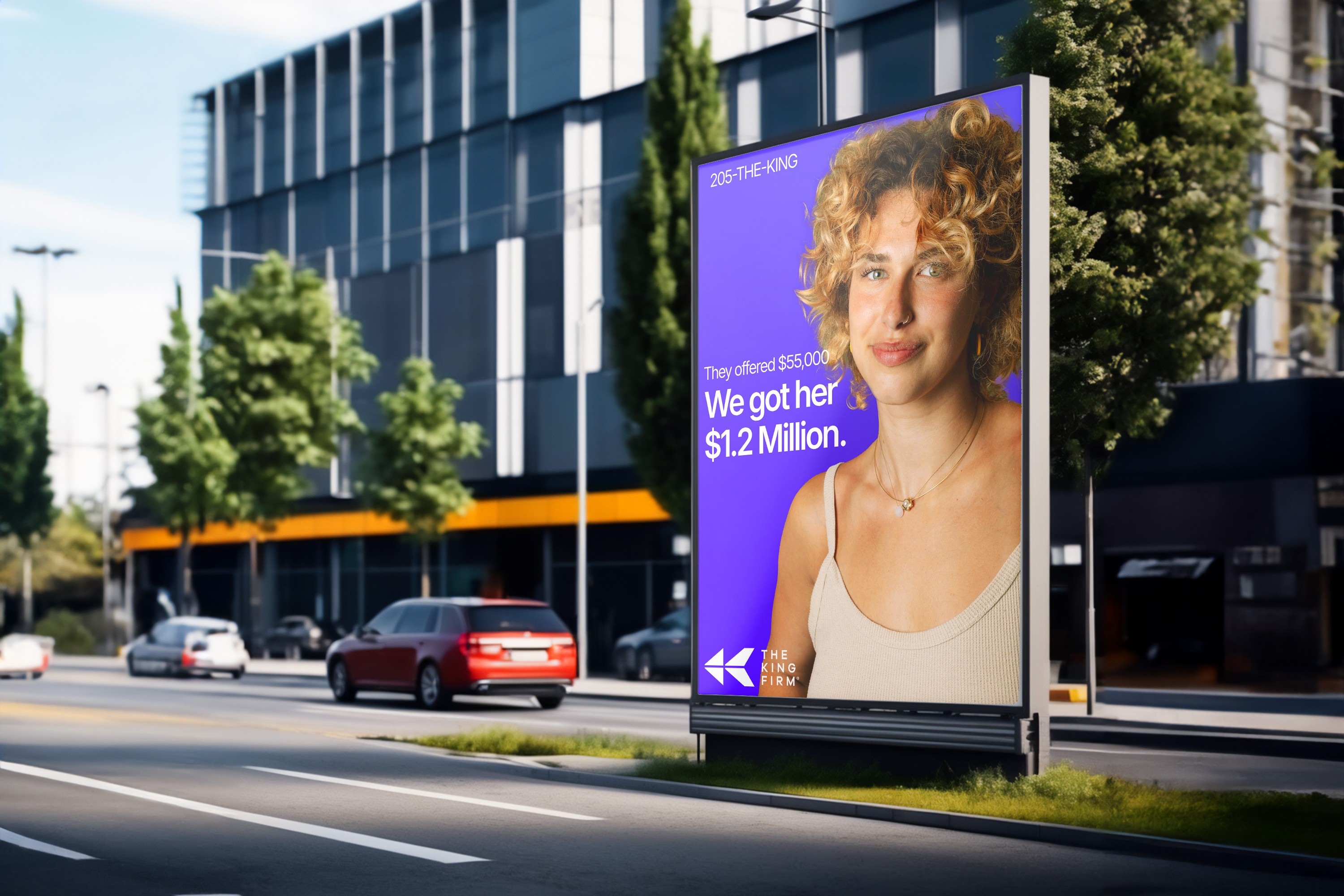
The following mockups are to give an idea of the tone of the brand in action. Strong, courageous, simple, but sophisticated.
Let the Crown Current color do some heavy lifting, by infusing a feeling of royalty and energy to the products.
But never forget that more often than not, your clients are in the hardest time of their lives, and it’s your job to protect them, to make them feel safe, fought for.
This concept shows a professional portrait of the firm in a posture of “guardians” during a harrowing time in their clients’ lives. The goal of this is to meet them where they are and usher them to justice.
This concept uses your own past won cases and settlements as billboards for your successful history. Juxtaposing the first settlement offer with the final offer your firm secured for your client shows just how much your tenacity, care, and expertise yields your client.
b1
b2
b3
b4
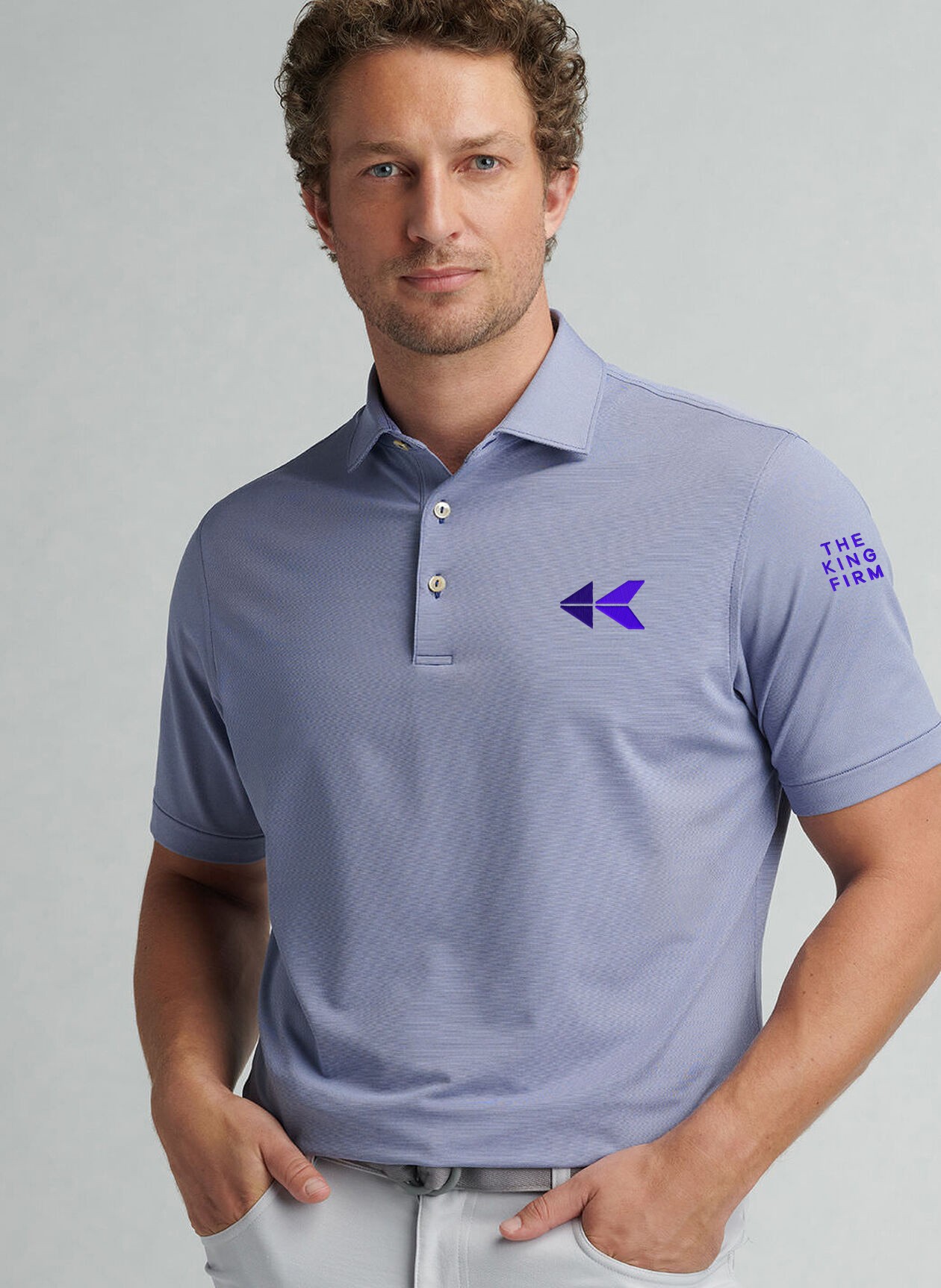
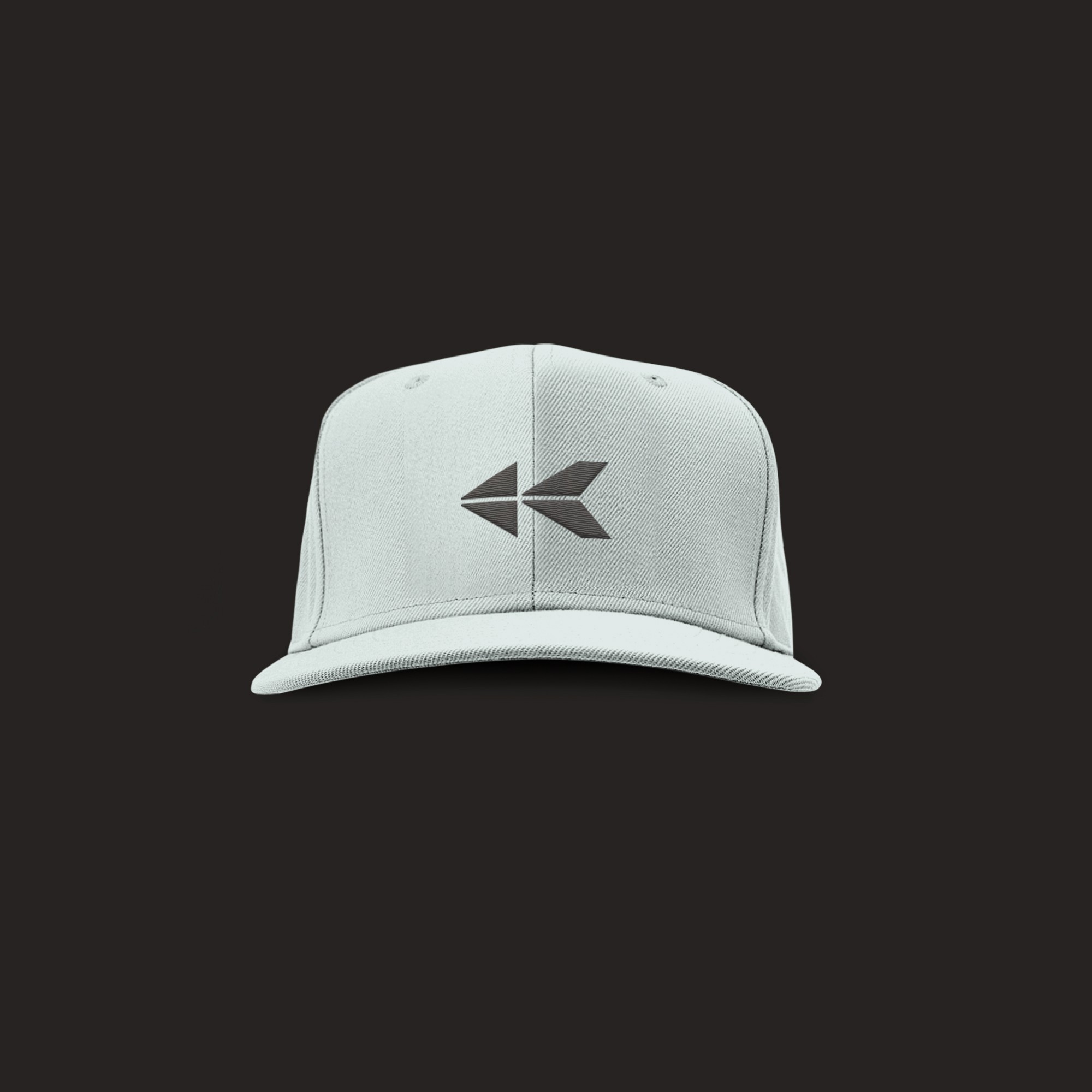
09A
Merchandise
m1
m2
contact the king
All Rights Reserved